7.02 Evolution of the Theme System
This section reflects some of my thought process when designing
a theming system.
7.02.01 Considerations:
When I was developing a theming system for dh_Toolkit I spent a
lot of time trying to decide between building upon the Lokasenna system
or starting from scratch. Lokasenna's system works fine for
monochrome themes, but I found that it lacks the range necessary
for "multi-colored" themes. I decided on a combination; start from
scratch, but use Lokasenna color names when practical. I
introduced some new colors, some which I deem necessary, and some
which are dedicated to the their intended use.
As I introduced colors I wanted to be sure not to break Lokasenna's
theming. One color that particularly caused me some trepidation
is "elm_outline". Lokasenna uses it for various features, all
fixed in code, including highlighting some focused elements.
Since dh_Toolkit classes will use an outline for various features
such as buttons, knobs, and slider thumbs, I decided to introduce
a theme color "btn_outline" for dh_Toolkit classes to use.
This will also ensure that any Lokasenna defined colors beginning
with "elm_" that are utilized by dh_Toolkit classes will only
use those for text elements (there are exceptions).
A main consideration is to try to keep it simple. Consistency is key.
While a theme designer has an almost unlimited palette to use,
what may look good using one theme may look terrible using another.
A script developer, whether using Lokasenna classes or dh_Toolkit classes,
should be able to apply any theme and have the interface look good.
It is also important that text has a good contrast with the background.
While this is easy to achieve with a monochrome theme,
some colored themes may present a challenge to individuals with
any degree of color-blindness.
That is why I offer several colors to use for text. I'm not sure
if that is necessary, but they are available. I also take a
screenshot of my themes and convert them to gray-scale
to test them for contrast.
Another consideration is what to name the colors. We can't call
them black, dark gray, medium gray, light gray, and white because
that would only apply to a particular (in this case, monochrome) theme.
And we can't call them darkest, dark, medium, light, lightest
because that may not be how a colored theme is applied.
It is best if a theme color indicates how it is to be used.
Imagine a kitchen. It could have floor color, wall color, ceiling color,
trim color, cabinet color, hardware color, etc. These are descriptive
names that indicate their use while the palette (theme) to be used
will define the actual colors.
7.02.02 Starting from scratch:
Start with a script window with a label. Here we will use a monochrome theme.
Let's call the window background color "wnd_bg" and paint it black.
Let's call the text color "txt" and paint it white.
Place a Button element:
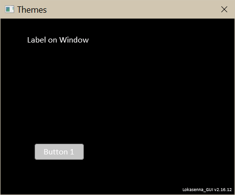
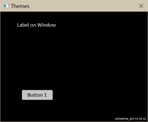
Give its face the color "btn_face" and paint it light gray.
Give it an outline color "btn_outline" and paint it medium gray.
Add text to the Button.
We need a new color for the text because the existing
"txt" color is white which doesn't work.
Let's call this color "btn_txt" and paint it black.
(We could use the black "wnd_bg" color for the text but we may need
more flexibility down the line.)
Place a Knob element:
Assign the Knob face the color "btn_face".
Assign the Knob outline the color "btn_outline".
Assign the Knob text the color "txt".
Assign the Knob outline the color "btn_outline".
Assign the Knob text the color "txt".
The Knob also has a attribute "knob head" (color property
"col_head") which describes the color of the pointer and highlighted text.
I chose to assign to "knob head" the current text color
of the background on which it is placed, because in my tests
it seems to provide good compatibilty amongst themes.
It is possible that another color might serve better for knob head.
In that case the script developer can assign a different theme
color to it. In my tests I haven't found it necessary to introduce
a dedicated color for it.
Place a Slider element:
A Slider has similar characteristics to the Knob when it comes to
theming, but with two additional features: track background and
track fill colors. They can be treated the same way as "knob head".
Give the Slider track a color property called "col_track_bg".
For now let's assign it the Lokasenna color "elm_bg"
(which is also used for text element backgrounds).
Assign "btn_face" to the Slider thumb.
For the track fill color give the Slider a color property
called "col_track_fill", and assign it a dedicated color "track_fill".
While this could have been set to default to, say, "elm_fill",
I like the flexibility of having a dedicated color. It is possible
that "elm_fill" works fine. In that case, the theme designer could
set it to that.
Place a Panel element:
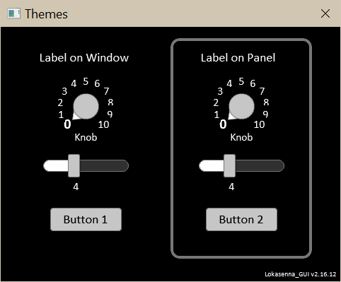
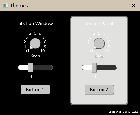

Place a Panel with just a border to group elements.
Assign the border the theme color "panel_border" and paint it medium gray.
(We could assign the Lokasenna color "elm_frame" to the border,
but we may need more flexibilty later on.)
Place a Label, a Knob, a Slider, and a Button on this panel.
So far, so good.
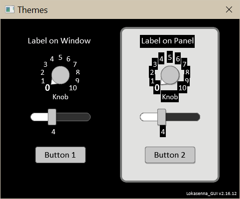
Now let's give the Panel a background color. Call it "panel_bg"
and paint it light gray.
The Label, Knob, and Slider backgrounds need to be set to the Panel background.
But then the white text on the light gray background is almost imperceptible.
So let's create a new color "panel_txt", paint it dark and
assign it to those elements text properties.
(We could have used "btn_txt" but we might need more flexibility down the line.)
Slider track fill shown using theme color "track_fill" painted medium gray.
Options:
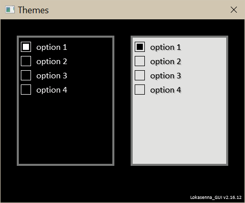
The Options class (Checkbox and Radio box) shares characteristics
similar to the Panel class. It has an optional border, and the
background color can be set to other than the default "wnd_bg".
In the following image the Checkbox on the left uses the default
colors "wnd_bg" for the background and "txt" for the text.
The checkbox on the right uses "panel_bg" for the background and
"panel_txt" for the text color.
While it is possible to override the option text, button outline,
and button fill colors it probably is not advisable for theme compatibility.
We could also have dedicated colors for these, which I did implement
at one point, but decided it wasn't necessary and only complicated matters.
Text Elements:
Text elements are the Listbox, Menubox, Textbox, and TextEditor.
These four share a common set of characteristics. They each primarily
consist of a box to display text, a minimal frame around the box,
and an outline which (with the exception of Listbox) highlights when focused.
The display box will use the theme color "elm_bg" which is generally
set to a very dark color. This requires a light colored text
to be used with it. Now, up to this point I have defined
three separate colors for text. It is still possible that neither
will suffice for this use. Plus, I believe that the text color
for this use should be tied to the text elements.
Therefore I introduce a new color "elm_txt".
This should always be paired to the text elements.
The Text elements frames (borders) will use the Lokasenna defined color
"elm_frame". We will use that instead of introducing a new color.
2026-02-04: I introduced element frames using highlight and lowlight colors as the default.
2026-02-04: I introduced element frames using highlight and lowlight colors as the default.
The Lokasenna text element classes use the color "elm_fill"
for highlighting the focused element. This may work well on a
monochrome theme, but I have found that for many themes it is imperceptible.
This color requires a high degree of contrast with the background to be noticable.
Therefore I introduced a dedicated color "elm_active" to be used for this purpose.
2026-02-04: I have yet to implement highlighting of focused elements. Lokasenna GUI does have provisions for tabbing to elements, and dh_Toolkit classes have at least some of the framework to allow this.
2026-02-04: I have yet to implement highlighting of focused elements. Lokasenna GUI does have provisions for tabbing to elements, and dh_Toolkit classes have at least some of the framework to allow this.
I also introduced the color "sel_txt" which may be used as an
alternative to highlight selected text in the text elements.
The default "elm_fill" uses an alpha of 0.5 which gets added to
the text background to create the highlight. "sel_txt" can
provide more flexibility by having its own color and alpha.
The Listbox and TextEditors have scrollbars. They consist of an
outline, a track, an a thumb. As a default they use "elm_outline" for
the outline, "elm_fill" for the track, and "elm_frame" for the thumb.
I also introduced two dedicated colors, "elm_track" and "elm_thumb"
for refining the scrollbar in case the defaults don't produce the
desired effect.
2026-02-04: Removed "elm_track" and "elm_thumb" colors. The default for the scrollbar track is now btn_face, and the scrollbar thumb and outline colors are auto calculated from the btn_face color.
2026-02-04: Removed "elm_track" and "elm_thumb" colors. The default for the scrollbar track is now btn_face, and the scrollbar thumb and outline colors are auto calculated from the btn_face color.
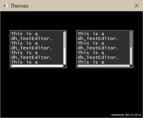
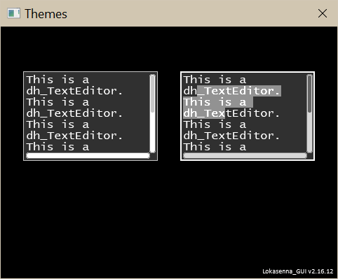
The following image shows two TextEditor elements. The left one
uses the Lokasenna defaults for the scrollbars. The right one uses
the new method.
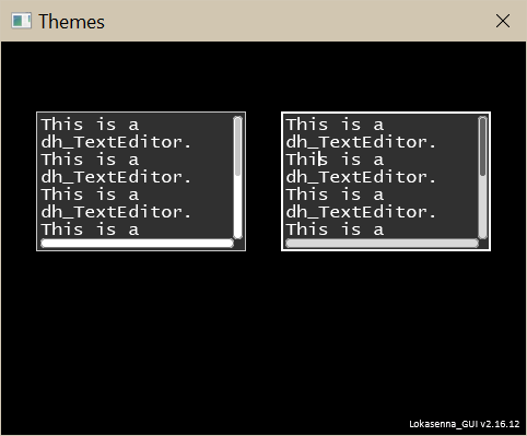
The next image shows the right TextEditor having focus.
Notice the outline has changed. The white outline on the black
background is noticable. But I find that in most every other
color combination the active outline is barely noticable.
A theme designer may have to experiment to find an appropriate
color to use.
This image shows the right TextEditor having some selected text.
Menubar:
The Menubar uses three colors. The background color (default "wnd_bg")
and text color (default "txt") can utilize any of the aforementioned
colors. When the cursor is over a menubar title the title becomes
highlighted. The highlight color gets added to the background color
to produce the highlight. The default highlight color is "elm_fill"
which works in most cases, although it is too bright sometimes.
I don't think a dedicated color is necessary here. Choosing a
different theme color should suffice.
Tabs:
Tabs utilize four colors: background, text, active tab, and inactive tab.
The background (space behind the tabs) uses "elm_bg" as its default.
The text color defaults to "txt".
The active tab will use the dedicated color "tab_active".
The inactive tab will use the dedicated color "tab_inactive".
While the Lokasenna defaults of "wnd_bg" and "tab_bg" could work,
I opted for dedicated colors. The script developer can still
override these.
Labels and Captions:
Some elements can have captions which are basically labels that
are part of the element. Their background should
match the background where they are placed, and the text color
should be that normally used with that background.
7.02.03 Gathering it all together:
Here are the theme colors introduced above:
-- Lokasenna defined:
wnd_bg
txt
elm_bg
elm_fill
elm_frame
elm_outline
tab_bg

-- dh_Toolkit defined:
btn_face
btn_outline
btn_txt
btn_face2
btn_outline2
btn_txt2
elm_active
elm_txt
panel_bg
panel_border
panel_txt
sel_txt
tab_active
tab inactive
track_fill
Here I identify almost four dozen element attributes
which need to be colored:
window bg
window text
label bg
label text
caption bg
caption text
button bg
button outline
button text
panel bg
panel border
panel text
("element" here refers to text elements)
element active
element bg
element frame
element text
menubox face
scrollbar outline
scrollbar track
scrollbar thumb
knob bg
knob text
knob body outline
knob boby face
knob pointer outline
knob pointer fill
slider bg
slider text
slider track bg
slider track outline
slider track fill
slider thumb outline
slider thumb face
options bg
options frame
option button outline
option button fill
option text
menubar bg
menubar text
menubar mouseover highlight
tabs bg
tabs text
tab active
tab inactive
This produces an unwieldy task for both the theme designer
and the script developer. Of course, many of these will share
a particular theme color.
7.02.04 Defining the color properties:
The color properties are defined in the elements class files.
Identify the various attributes of the elements which need to be colored.
Give them a descriptive property name.
Be consistent amongst elements.
Here is a non-exhaustive list:
-----------------------------------------------------------------------------------------
Class:     background  text        border        other
-----------------------------------------------------------------------------------------
Label:     col_bg      col_text
Button:    col_bg      col_text    col_outline
Panel:     col_bg      col_text    col_border
Elements*: col_bg      col_text    col_frame    col_sel_text
Knob:      col_bg      col_values               col_body         col_head
Slider:    col_bg      col_values               col_track        col_thumb       col_fill
Options:   col_bg      col_text    col_border   col_opt_outline  col_opt_fill
Menubar:   col_bg      col_text                 col_over
Tabs:      col_bg      col_text                 col_tab_active   col_tab_inactive

*  Elements refer to text elements: Listbox, Menubox, Textbox, and TextEditor.

Scrollbar: col_track   col_thumb  col_sb_outline
(Scrollbar is used in Listbox and TextEditor.)
(col_thumb and col_sb_outline now auto calculated.)

Caption:   col_cap_bg   col_cap_text
Captions are equivalent of a label attached to and as a part
of an element. When used on text elements it requires different
property names to distinguish from core properties.

Focused:   col_active
Proposed as outline color for focused elements.
Needs great contrast against background.
Currently only used with Menubox, Textbox, and TextEditor.
-----------------------------------------------------------------------------------------
7.02.05 Define the default colors for the properties:
From this set assign a theme color to each color property as a default.
Ideally, the defaults should display nicely. And it is probably
a good practice for a script developer to stay with the defaults,
except where prescribed.
Let's use an example.
Say a Panel has its color property "col_bg" default
to theme color "wnd_bg", When changing themes it will use that
theme's "wnd_bg" color. Fine. A script developer can set the color
property to use "panel_bg" instead. Changing themes will then
use that theme's "panel_bg".
Either choice should transfer nicely when changing themes.
This chart shows where the theme colors are used as the
defaults for dh_Toolkit classes. They differ in some instances
from the defaults used in Lokasenna classes. See section
6.14 Classes-defaults for a side by side comparison.
-----------------------------------------------------
color         dh_Toolkit defaults    [class property]
-----------------------------------------------------
 -- Lokasenna defined colors:

 wnd_bg       script window          [col_bg]
              options bg             [col_bg]
              panel bg               [col_bg]
              tab active             [col_bg]
              label bg *             [col_bg]
              caption bg *           [col_cap_bg]
              knob bg *              [col_bg]
              slider bg *            [col_bg]

              * set these to match bg of where placed

 txt          label text             [col_text]
              caption text           [col_cap_text]
              knob pointer and
                 highlighted text    [col_head]
              knob values            [col_values]
              option button outline  [col_opt_outline]
              option button fill     [col_opt_fill]
              options text           [col_text]
              panel text             [col_text]
              slider values          [col_values]
              tabs text              [col_text]

 elm_bg       text elements bg       [col_bg]
              slider track bg        [col_track_bg]
              tabs bg                [col_bg]

 elm_fill     selected text highlight [col_sel_text]
              (listbox, textbox, texteditor)

              menubar mouseover highlight   [col_over]

 elm_frame    text elements frame    [col_frame]
              slider track outline   [col_track_outline]

 elm_outline

 --dh_Toolkit defined colors:

 btn_face     button face            [col_bg]
              knob body              [col_body]
              menubar bg             [col_bg]
              menubox face           [col_face]
              slider thumb           [col_thumb]
              scrollbar track        [col_track]

 btn_outline
              button outline         [col_outline]
              knob outline           [col_outline]
              scrollbar outline      [col_sb_outline]
              slider thumb outline   [col_outline]

 btn_txt      button text            [col_text]
              menubar text           [col_text]

 elm_active   outline focused        [col_active]
              (menubox, textbox, texteditor)

 elm_txt      text elements text     [col_text]

 panel_bg     alternate for panel background   [col_bg]
              alternate for options background [col_bg]

 panel_border options border         [col_border]
              panel border           [col_border]

 panel_txt    alternate for panel text         [col_text]

 sel_txt      alternate for selected text      [col_sel_text]

 tab_active   active tab                       [col_tab_active]

 tab_inactive inactive tab                     [col_tab_inactive]

 track_fill   slider track fill                [col_fill]

-----------------------------------------------------
7.02.06 Final thoughts:
Will there be issues when placing an element on "panel_bg"
as opposed to "wnd_bg"? Possibly. Elements using "btn_face",
"btn_outline", and possibly "track_fill" may appear different
depending on the background where they are placed. Do I introduce
"btn_face2", "btn_outline2", and "btn_txt2" to accommodate
this possibility?